
Non ! Ce n’est pas une recette ! Juste un petit test créatif.
En fait je suis toujours et de plus en plus impressionnée par ce que l’on arrive à faire juste avec du CSS, alors j’ai voulu m’y essayer, comme ça.
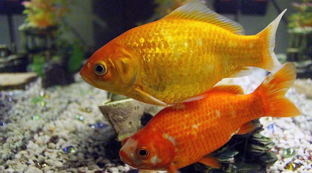
Et donc ceci n’est pas une image, mais bel et bien juste une suite de lignes de “code” CSS (copyright lpp !): Il s’agit en fait d’une superposition de formes: ovales et triangles !
Le html:
<div class="pois"></div>
<div class="pois"></div>
<div class="pois"></div>
<div class="aquarium">
<div class="nageoirehaut"></div>
<div class="nageoirebas1"></div>
<div class="nageoirebas2"></div>
<div class="queue"></div>
<div class="queue2"></div>
<div class="corps"></div>
<div class="oeil"></div>
La feuille de style:
.pois {
    background-color: #00FF99;
    width:20px;
    height:20px;
    position:relative;
    border-radius: 50%;
    box-shadow: inset -5px -5px 5px rgba(0,0,0,.5);
    float:left;
    margin-top:80px;
    margin-right:20px
}

 .aquarium {
    background-color: #84CCD1;
    width:300px;
    height:200px;
    position:relative;
    border-radius: 50%;
    float:left;
}

.corps {
   width: 200px;
   height: 50px;
   background-color: #C70203;
   border-radius: 50%;
   position:absolute;
   left: 10px;
   top: 60px


}
.oeil {
   width: 5px;
   height: 5px;
   background-color: #000;
   border-radius: 50%;
   position:absolute;
   left: 50px;
   top: 80px
}

.nageoirehaut {
   width: 0;
   height: 0;
   border-left: 50px solid transparent;
   border-right: 25px solid transparent;
   border-top:55px solid #E96300;
   position:absolute;
   left: 75px;
   top: 45px;
   -ms-transform: rotate(10deg); /* IE 9 */
   -webkit-transform: rotate(10deg); /* Chrome, Safari, Opera */
   transform: rotate(10deg);
}

.nageoirebas1 {
   width: 15px;
   height: 50px;
   background-color: #E96300;
   border-radius: 50%;
   position:absolute;
   -ms-transform: rotate(25deg); /* IE 9 */
   -webkit-transform: rotate(25deg); /* Chrome, Safari, Opera */
   transform: rotate(25deg);
   left: 50px;
   top: 80px
}

.nageoirebas2 {
   width: 0;
   height: 0;
   border-left: 25px solid transparent;
   border-right: 15px solid transparent;
   border-top:55px solid #E96300;
   position:absolute;
   left: 120px;
   top: 75px;
   -ms-transform: rotate(170deg); /* IE 9 */
   -webkit-transform: rotate(170deg); /* Chrome, Safari, Opera */
    transform: rotate(170deg);
}
.queue {
   width: 0;
   height: 0;
   border-top: 50px solid transparent;
   border-bottom: 50px solid transparent;
   border-right:50px solid #E96300;
   position:absolute;
   top: 35px;
   left: 195px;
}
.queue2 {
   width: 0;
   height: 0;
   border-top: 50px solid transparent;
   border-bottom: 50px solid transparent;
   border-right:20px solid #84CCD1;
   position:absolute;
   top: 35px;
   left: 225px;
}

-->
</style>